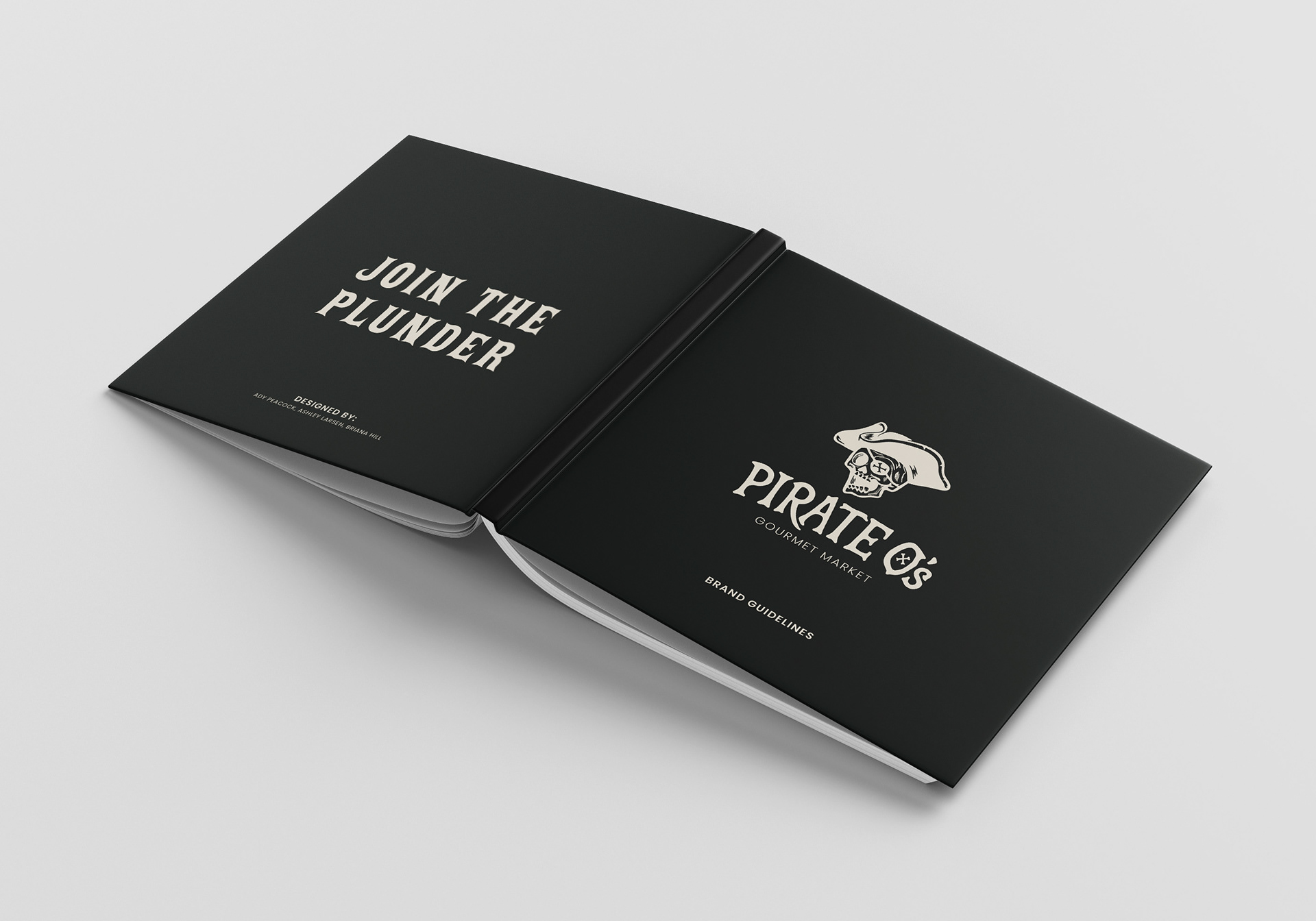
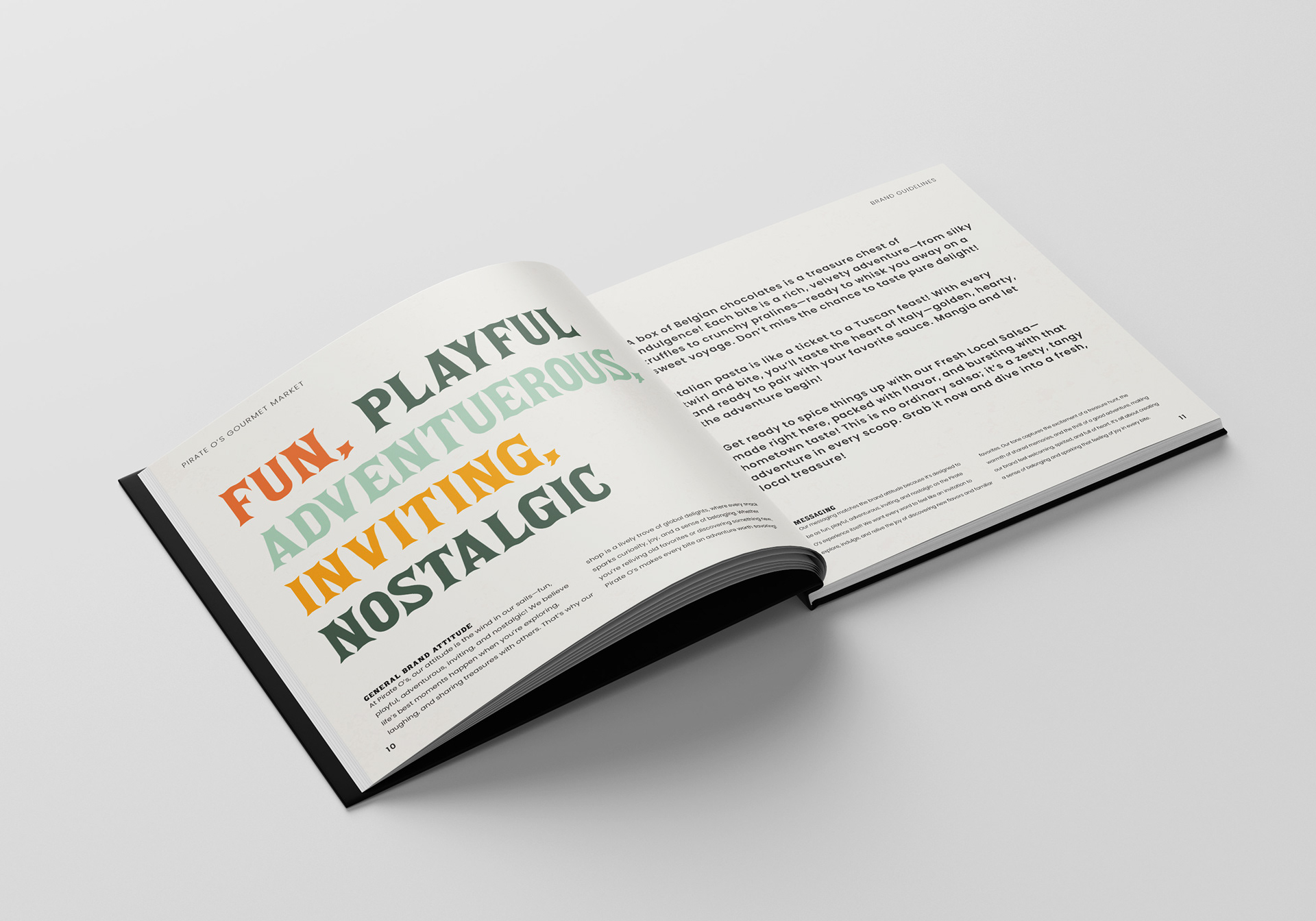
Pirate O's is a beloved Utah gem, a market filled with a trove of global delights, where every snack sparks curiosity, joy, and a sense of belonging. Whether you’re reliving old favorites or discovering something new, Pirate O’s makes every bite an adventure worth savoring! The brand identity had a lot to live up to. Me and two other designers felt with a refreshed brand we could better bring those feeling across.
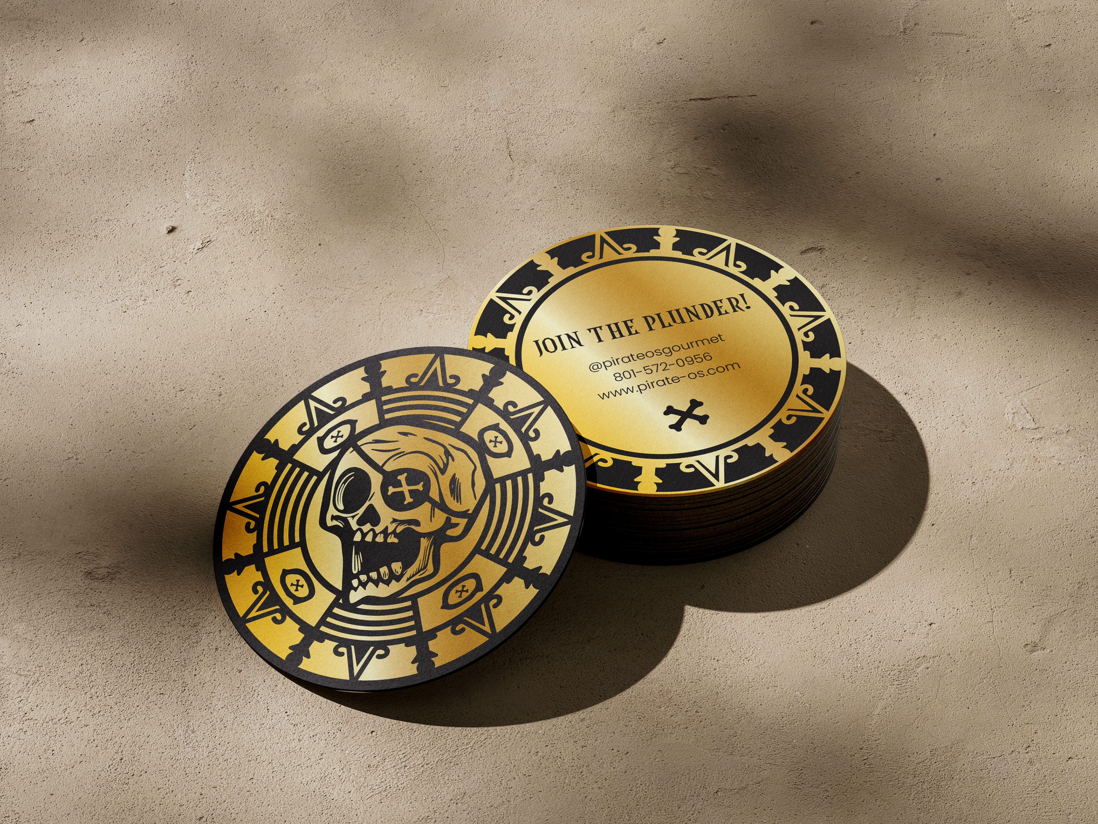
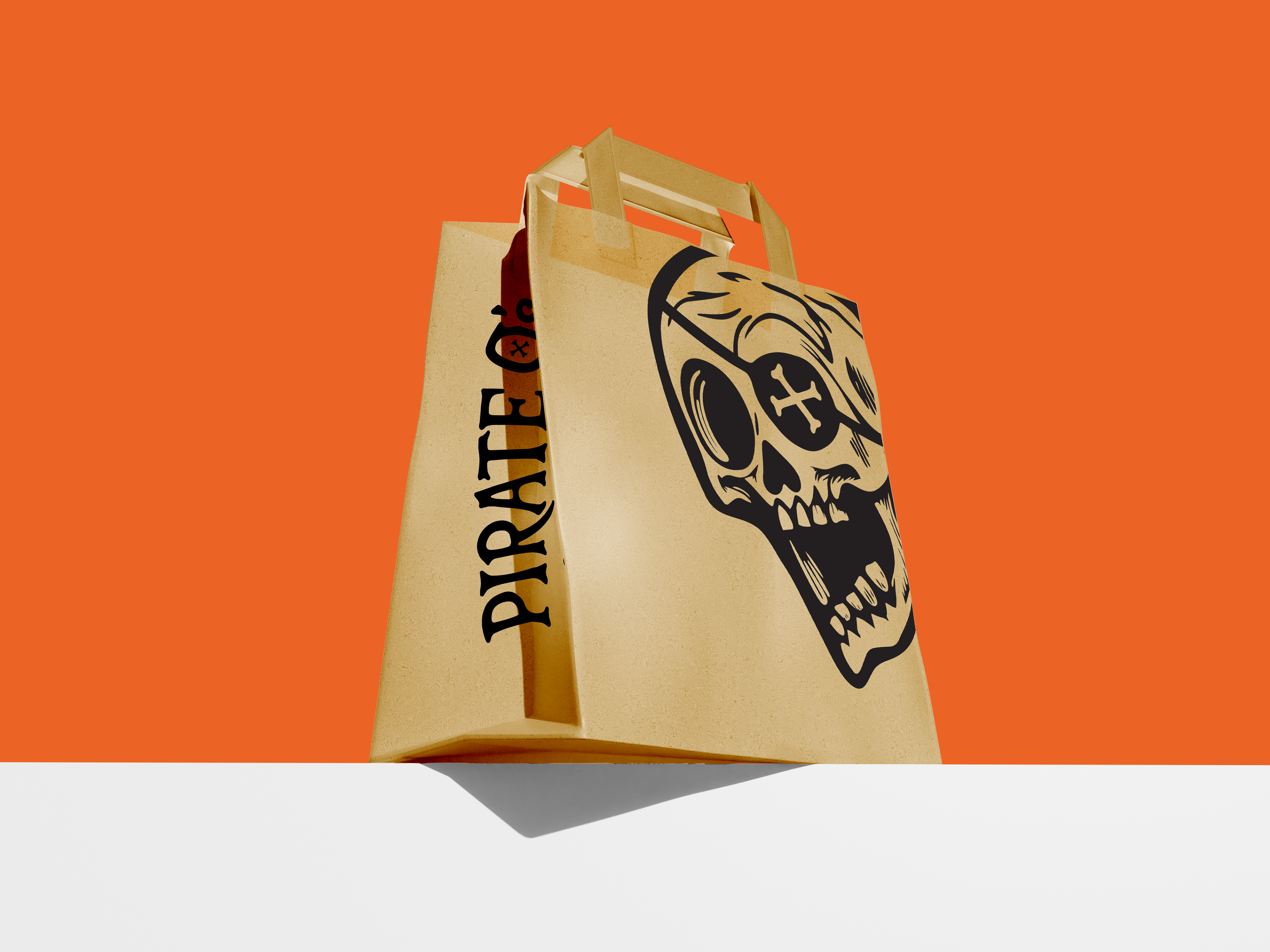
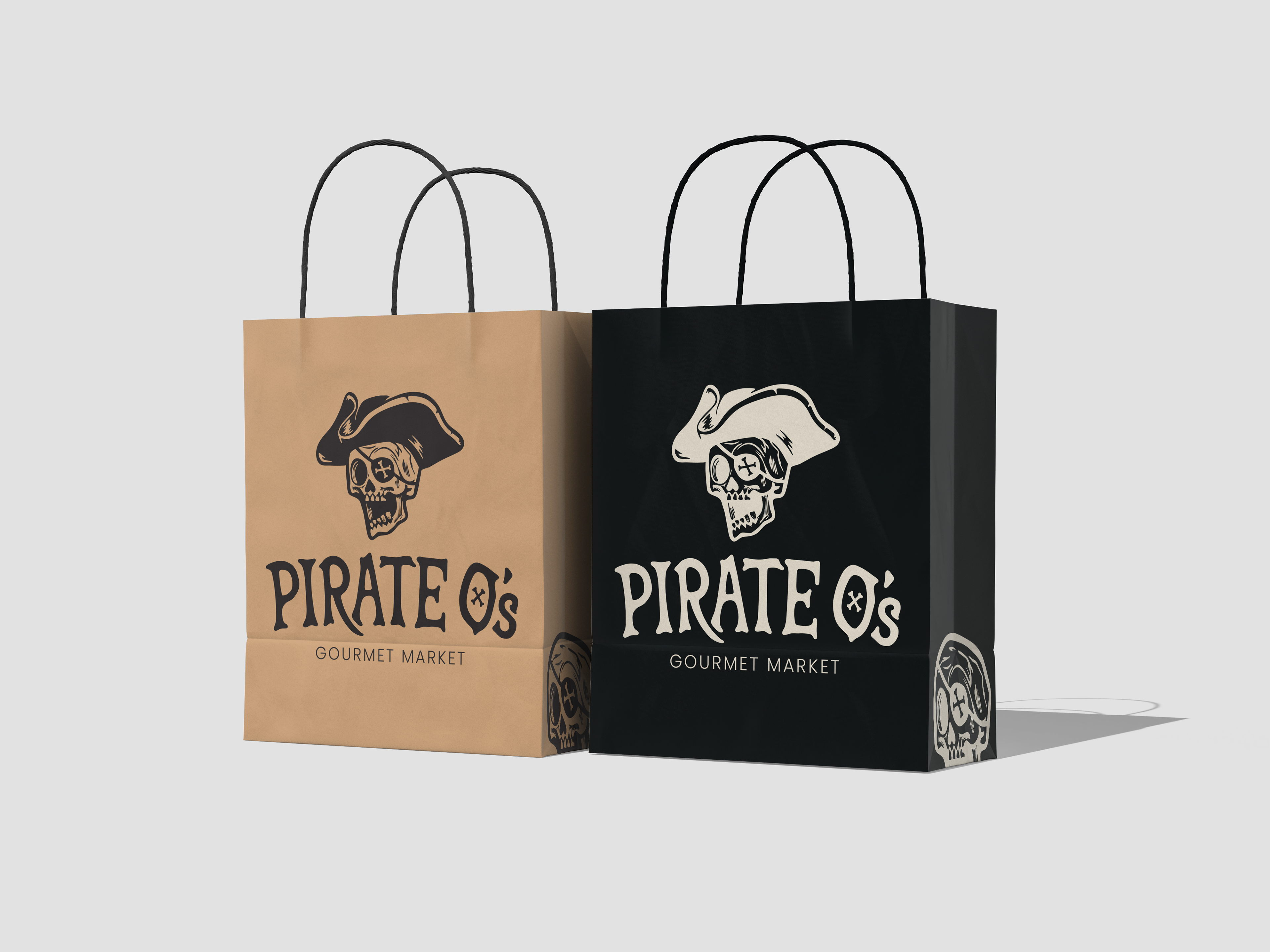
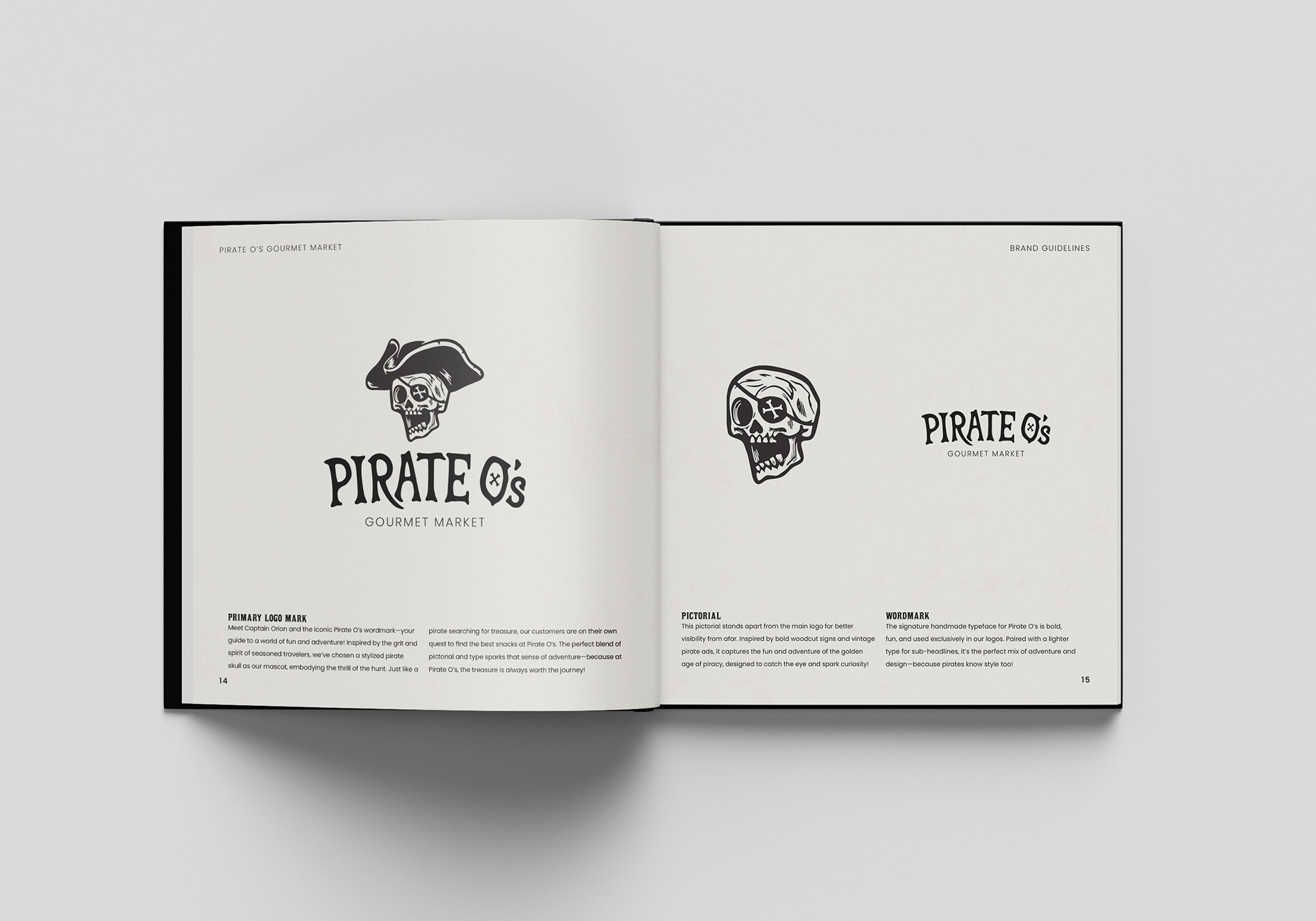
Inspired by the grit and spirit of seasoned travelers, we’ve chosen a stylized pirate skull as our mascot, embodying the thrill of the hunt. Just like a pirate searching for treasure, our customers are on their own quest to find the best snacks at Pirate O’s.
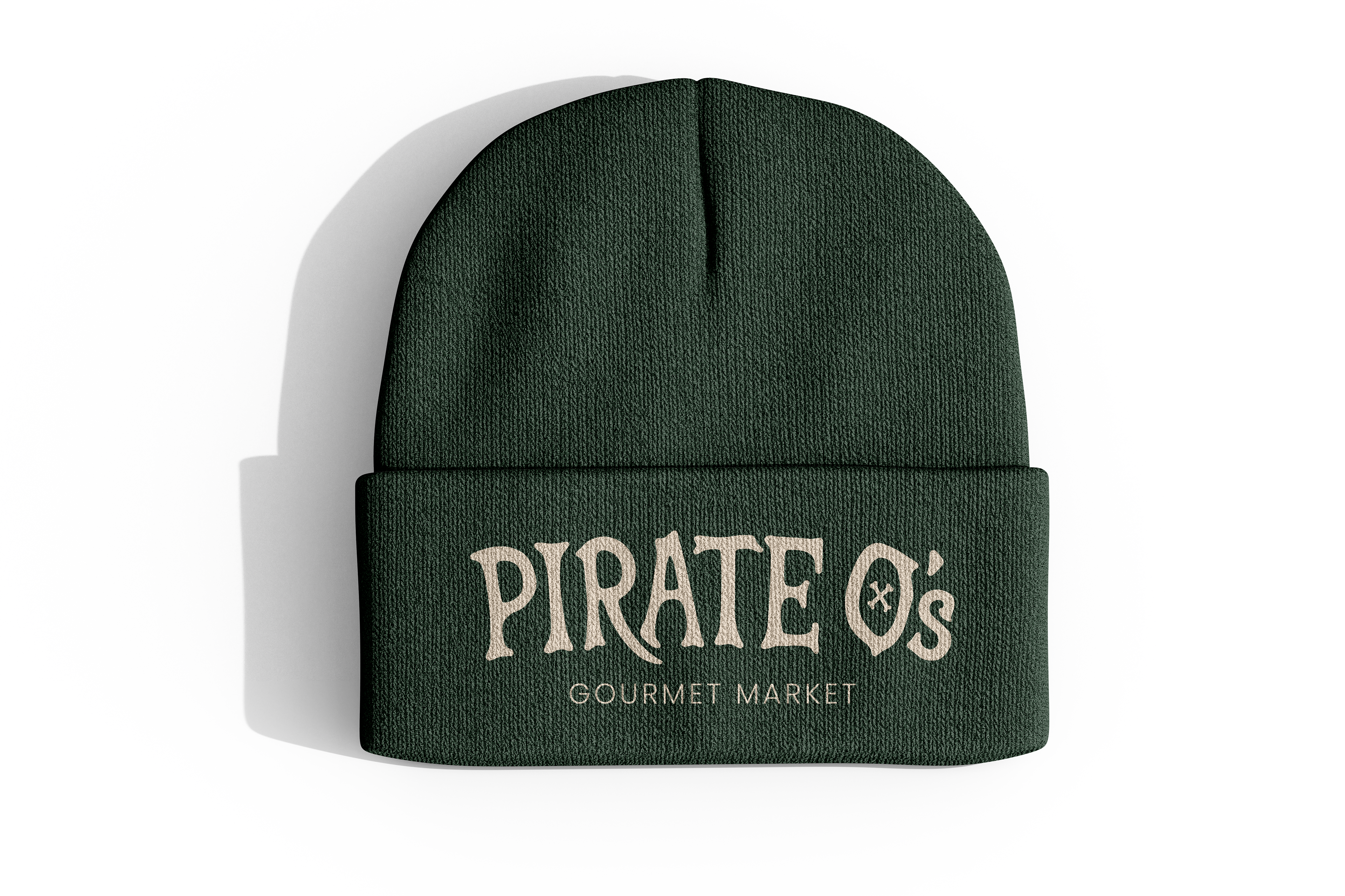
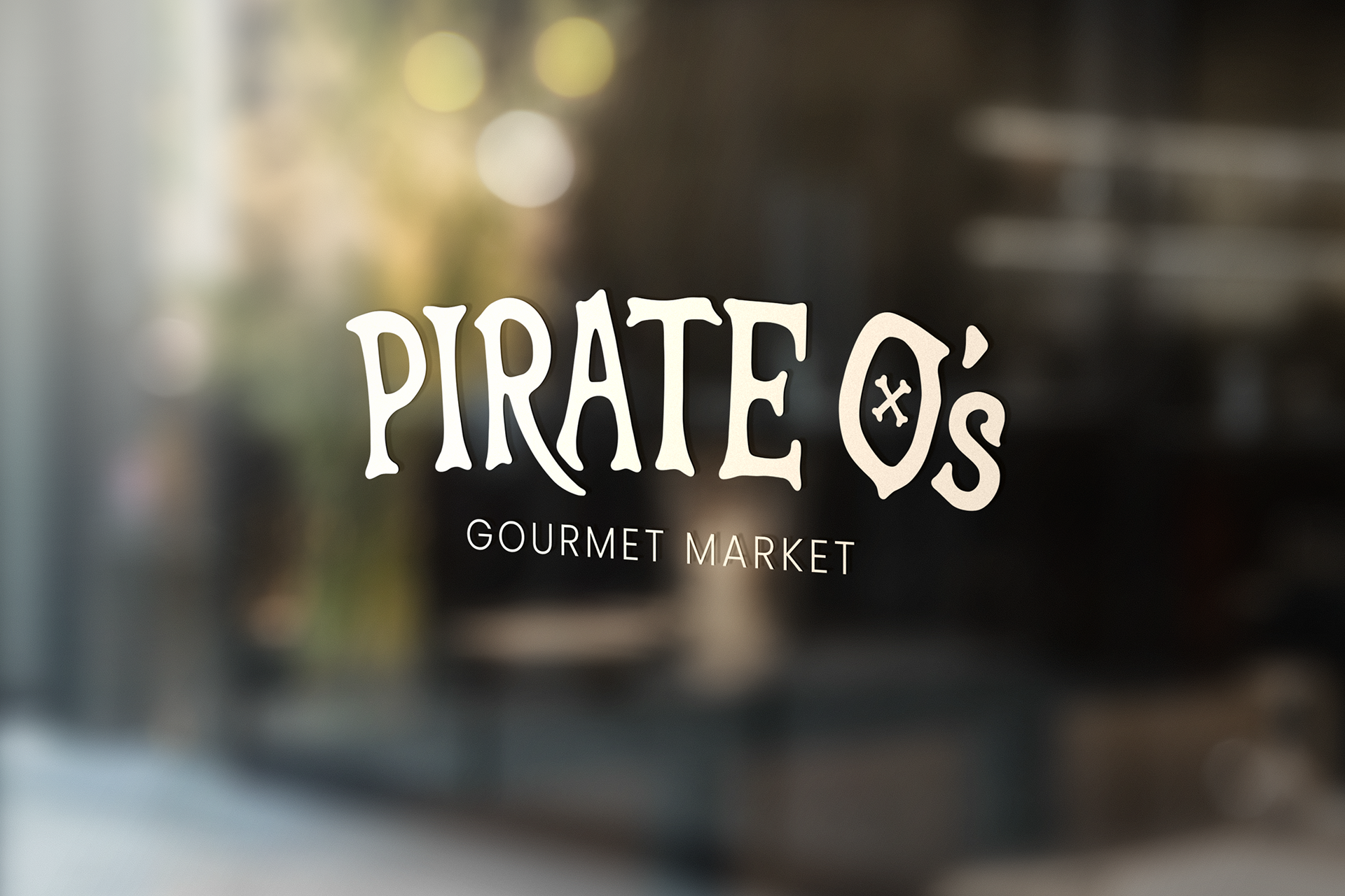
The logo features an icon inspired by woodcut prints and old pirate ads. I designed the typography for the Pirate O's word mark from scratch because I felt I could create the perfect bold and fun typeface that would be exclusive to this brand.
STYLE GUIDE
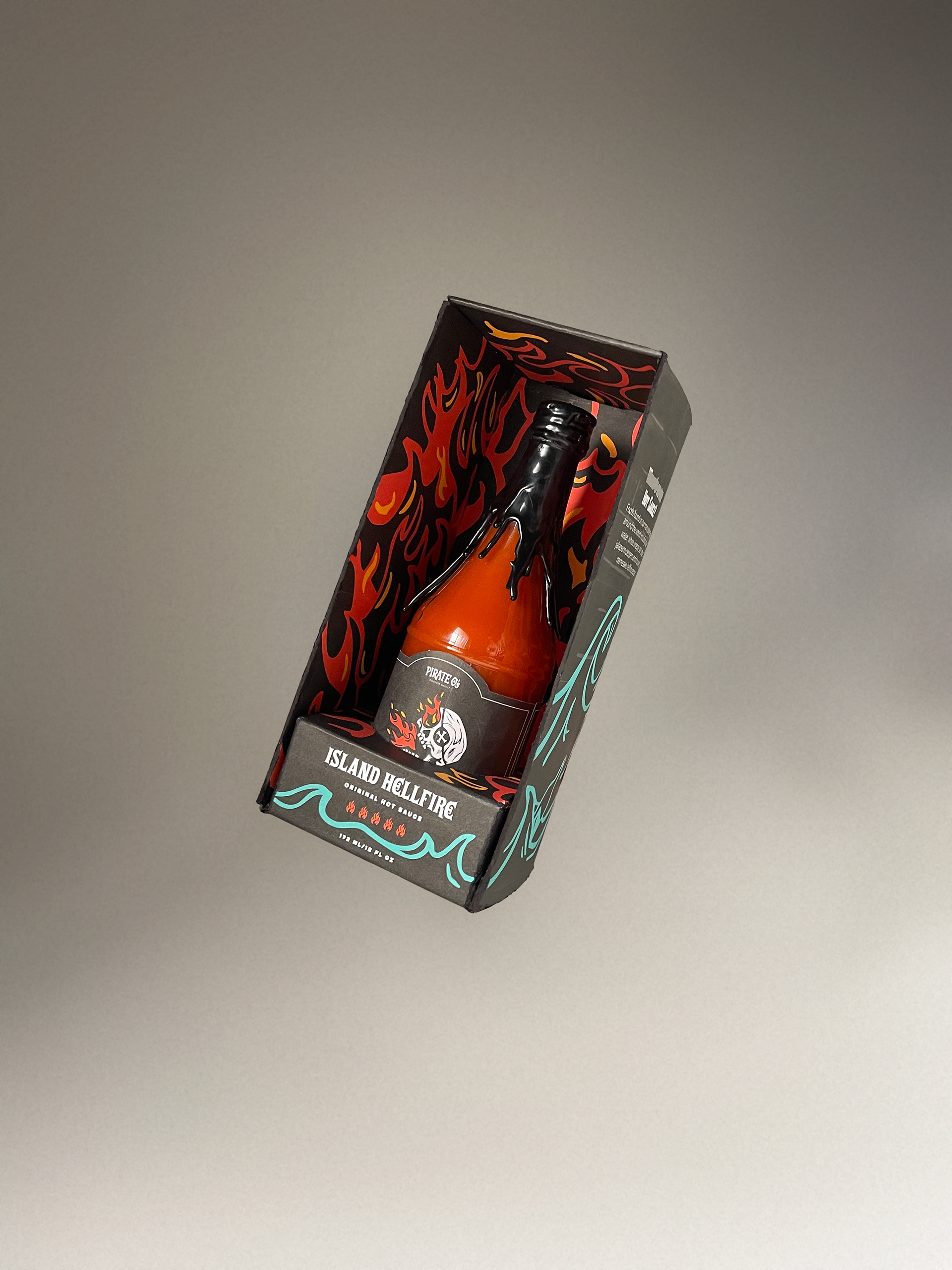
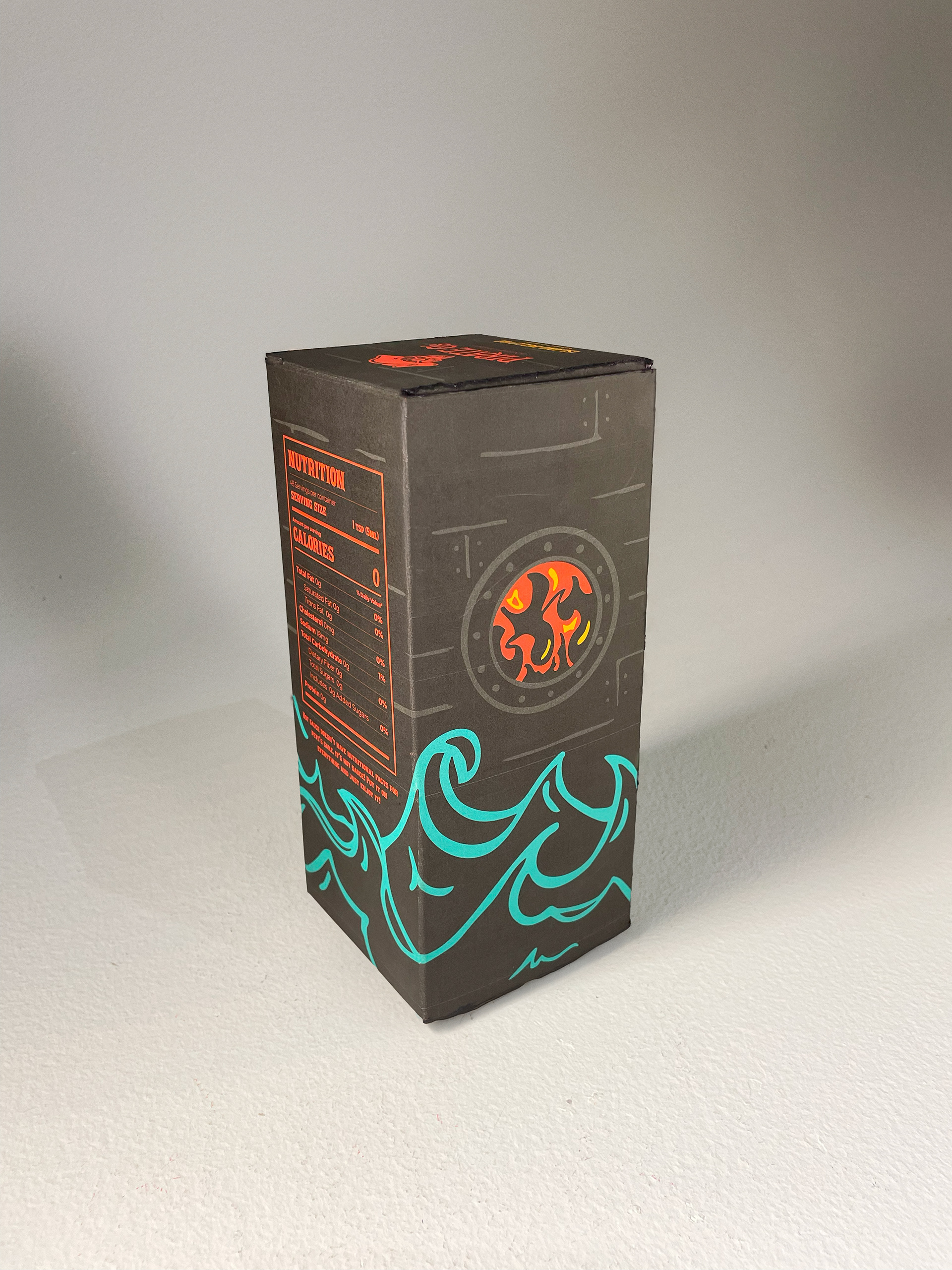
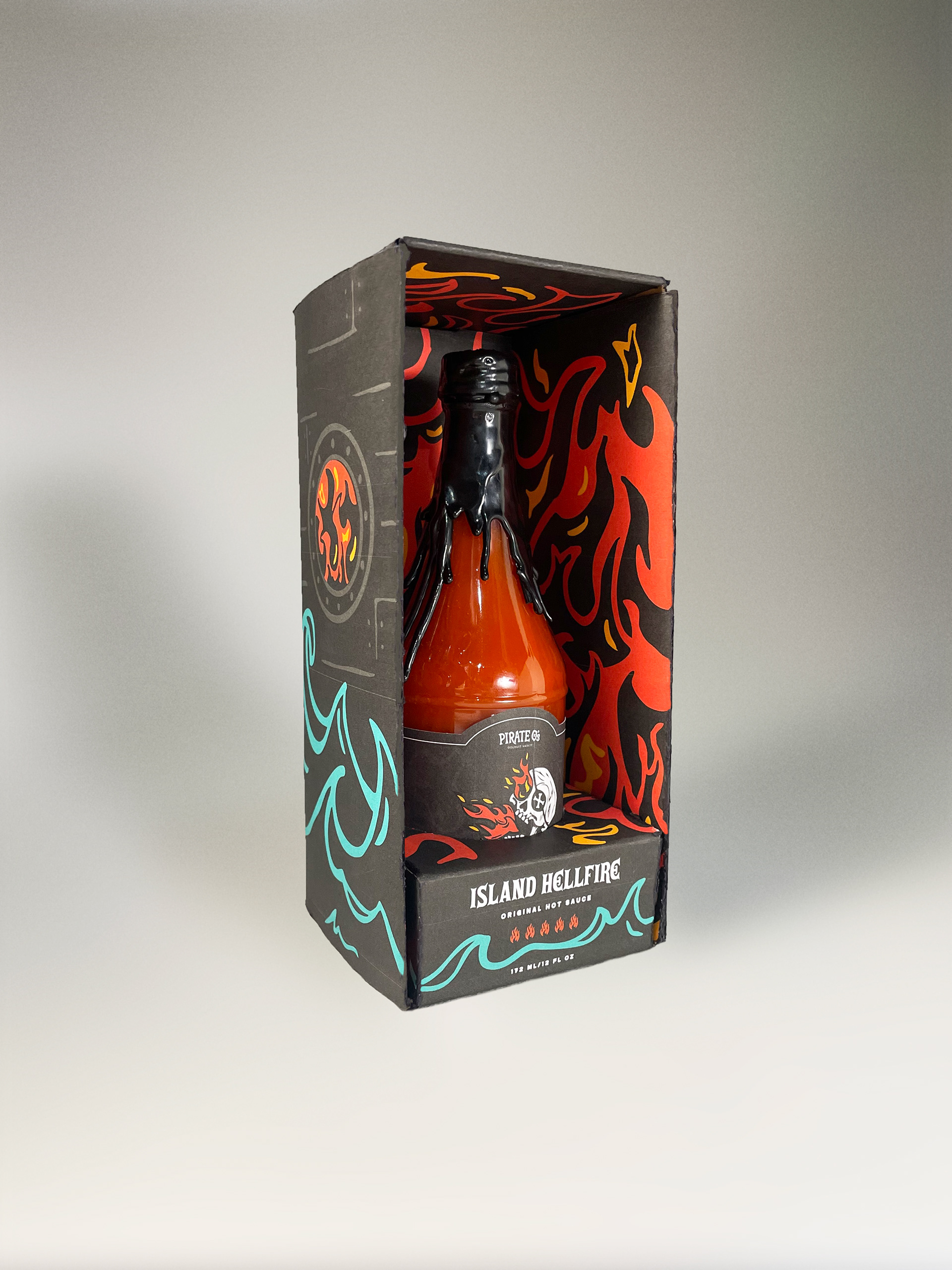
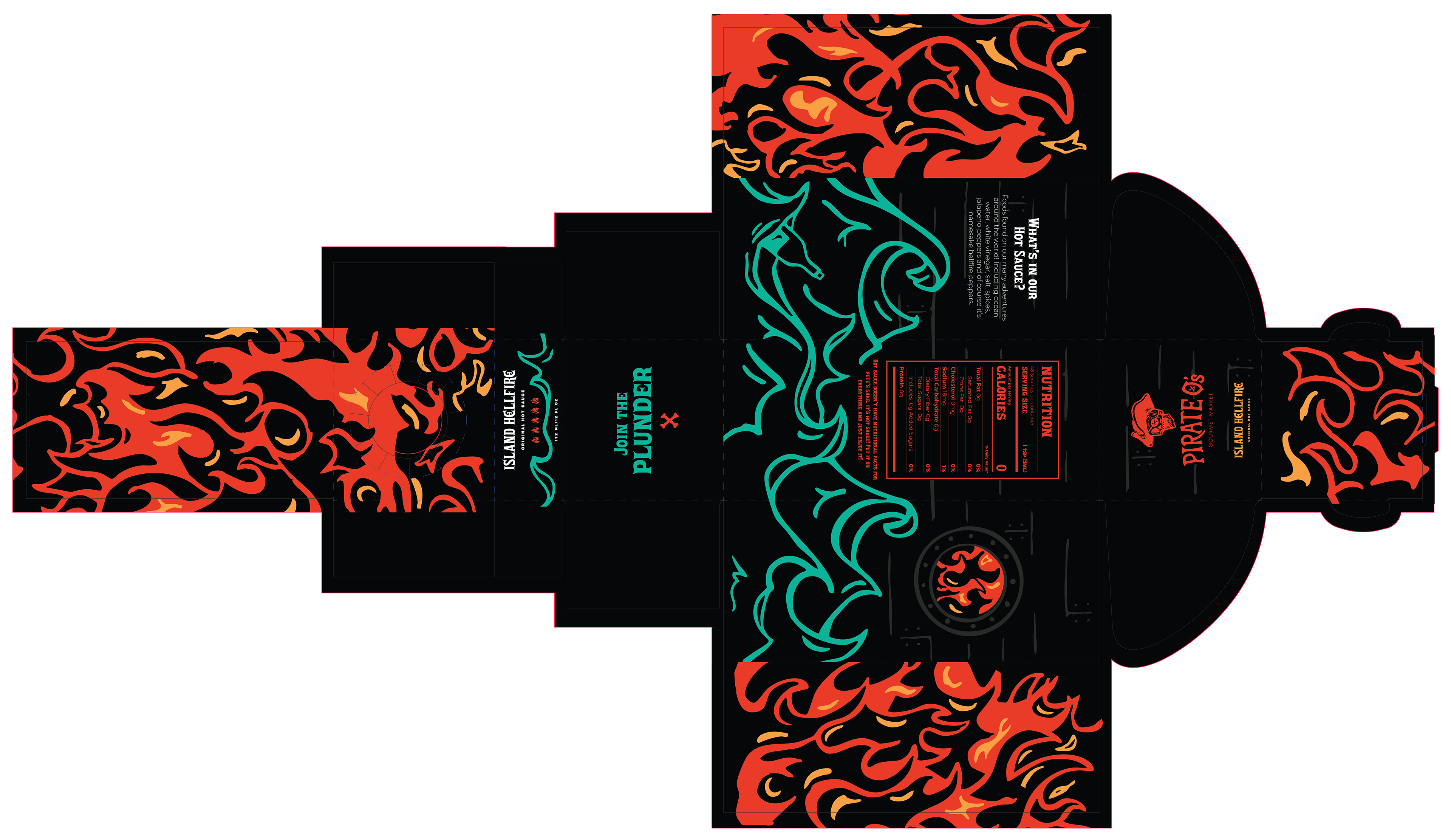
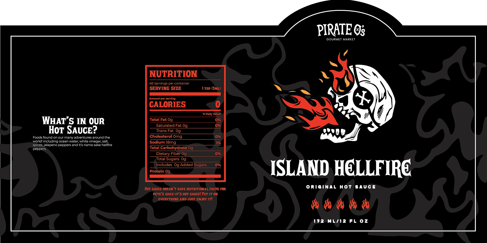
PRODUCT PACKAGING
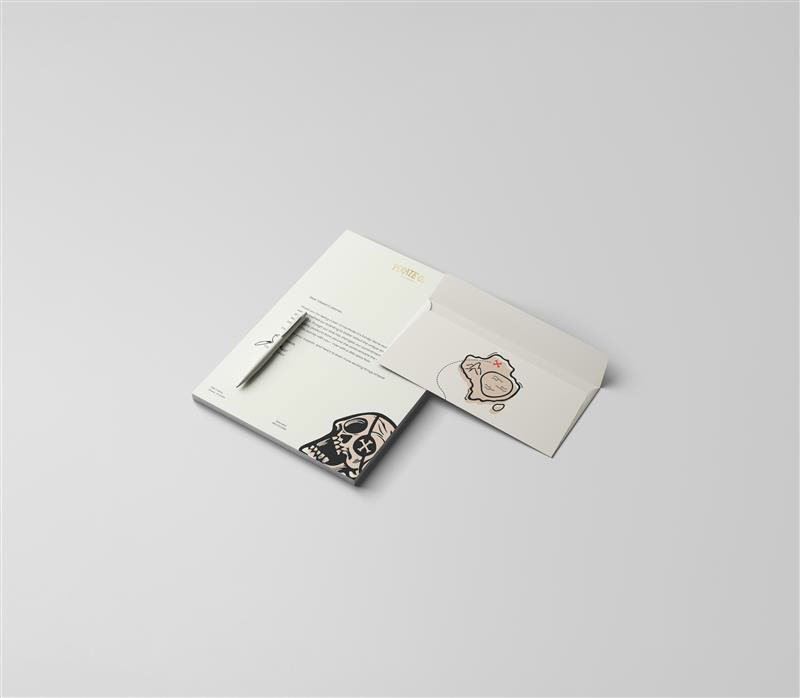
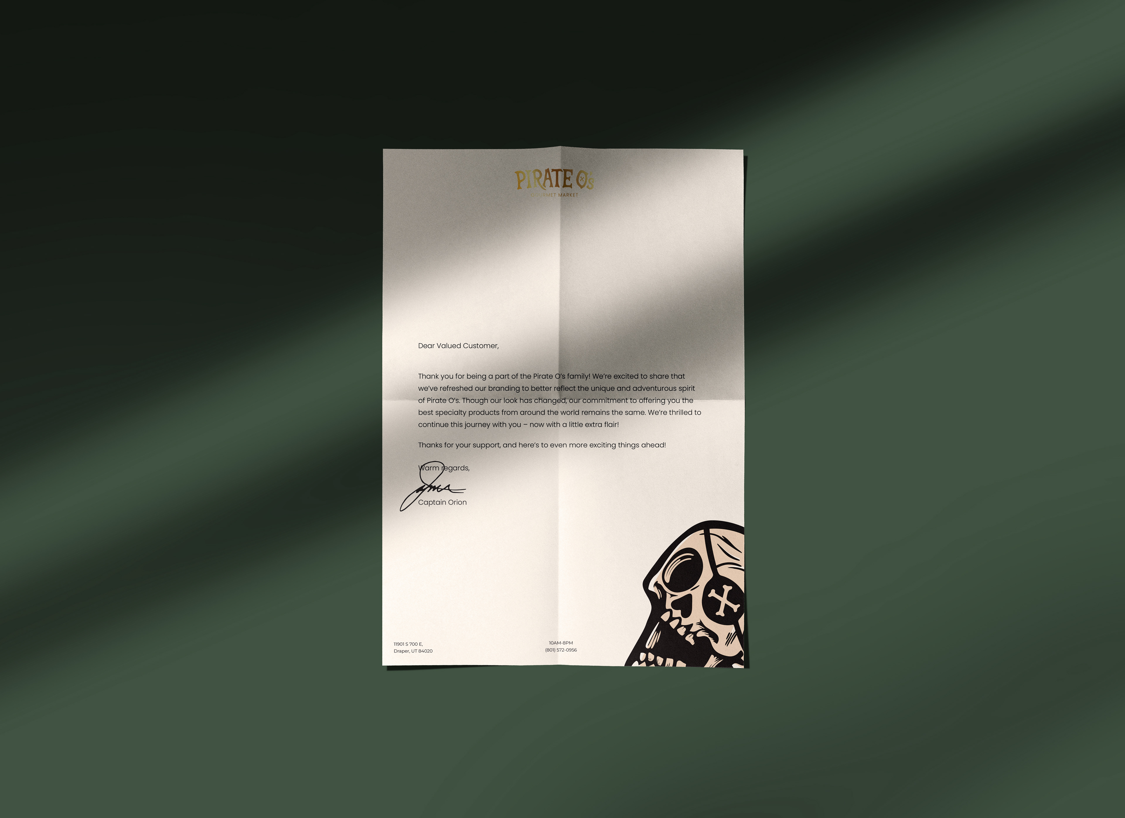
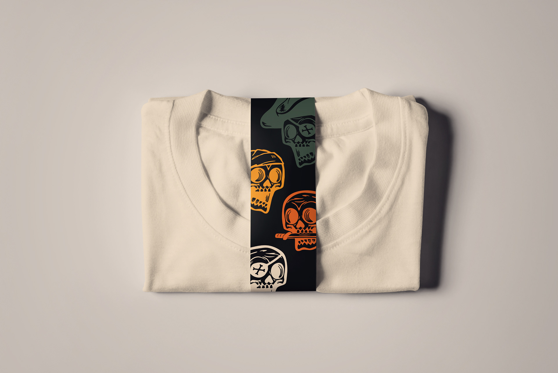
STATIONARY & MERCHANDISE
